Accessible Images, Icons and Emojis
For developers who want to:
- Add meaningful alternative text to your content's images
- Identify cases where alternative text is not required
- Handle 'alternative imagery' such as Font Awesome icons and Emojis
One of the first things we often learn about web accessibility is that we need to provide alternative text for images we use in our websites and apps. This is important because the alt text on an image provides contextual information to:
- Visually impaired users (via screen readers), who can’t otherwise see the image well
- Users with slow network connections who may have trouble loading your images
- Crawlers that dictate your SEO, which need a way to understand what content is presented on your page without seeing it
When it comes to actually implementing that alternative text however, it can be so hard to know what to write!
Common failings of alt text
There are many instances of alt text on the web that fall into one of the below failings:
- Repeating what surrounding text already describes
- Using redundant phrases like “Image of…”
- Providing meaningless alternative text for a purely decorative component (e.g. “divider line”)
- Focusing on what the image looks like, rather than what it is being used to convey (either in content or function)
This article will step through a few key questions you can ask yourself when adding imagery to your content, to help you identify meaningful alternative text. We’ll also then take a look at some alternative imagery you might use (emojis & font awesome icons) and how to handle those in an accessible way.
Question 1: Does Your Image Actually Need Alternative Text?
It’s worth saying loud and clear, although all <img /> elements must have an alt attribute, not all images need alternative text. Often we use images in a way that are purely decorative, e.g. to help space out a page, add a bit of color to a very text-heavy page, use as fancy bullet points, etc. In cases where the image used is purely decorative, it is acceptable to provide empty alternative text.
Ask yourself, if this image wasn’t present on the page, what would the user miss out on? If the answer is purely that it wouldn’t look as nice, then it sounds like you don’t need alternative text.
Some examples where alternative text wouldn’t be necessary:
Images used for layout purposes only

In the example above, the image is used to provide a decorative dividing line. It adds no contextual or functional value, and therefore the alt attribute can happily be left empty - i.e. alt=""
Images used as bullet points
 List Item One
- List Item Two
In this example, the standard list style has been removed, and images have been used in each li item instead. The code would look something like this:
If we set alternative text on every image, screen reader users would hear the same alt text announced at the start of every list item. This would be pretty noisy, and for no additional value, since the icons are purely decorative. It’s another great use case for empty alt text.
Images where the surrounding text is descriptive enough already
Sometimes when we use an image to convey context on a page, we also add text which captions the image, or otherwise describes it. Consider the following example:
Slice of Cherry Pie: 500 calories
Depending on what we want to achieve, there might not be a need to add alternative text to this image, as long as there is nothing further we want to communicate beyond what is already written in the text beside it. In this case again, empty alt text would be acceptable.
However, if we do want to convey something additional with the image, then we would need to add the relevant alternative text. For example, imagine if the text “Slice of Cherry Pie” was missing from the example above. In that case, it would be relevant to add alt text, otherwise we haven’t successfully conveyed the message that a slice of cherry pie is 500 calories.
Question 2: Does this image have a function?
Through asking question 1, you’ve established you need some alternative text for your image. The next question then addresses what kind of image you’re trying to describe. Many images in your app might have a function attached to them, rather than purely being part of your content.
For example, consider the header section of this page, which includes an image of the “Up Your A11y” logo.
In this case, it would make sense for the alternative text to succinctly convey the function of the image, e.g. “Home”.
Don’t be tempted to add redundant additional text, for example: “Link to Home”, “Navigate Home”, “Back to Home Page”, “Home Icon”, etc. The semantics of the HTML take care of this information for you already.
The image will be part of a link, and so the screen reader will already announced that it is an image and a link. Avoiding redundant alt text like this will really help streamline the experience for your screen reader users.
Question 3: What additional content does this image provide?
Through steps 1 and 2, we’ve established that the image conveys some content, but it doesn’t have an associated function. The image is therefore part of the content you are providing, and alternative text is required to make sure that users don’t lose the context it provides.
When considering what alternative text to add to your image the key guidance is once again to put yourself in the shoes of the user - “if I couldn’t see this image, what would I need to know to appreciate this content?”. It is not an easy question to answer, but it is worth considering carefully. Remember that the alternative text you provide is not only used by screen readers, but also to display on the page if the image fails to load, and for search engines to understand your content.
The same image in different situations would require different alternative text. By way of an example, consider the following examples using the same image:
Example 1: the image is used liked a title
Ingredients: 100g cherries, 50g sugar...
Here you can see that we are using the image like a title, with the description below going on to explain the ingredients or recipe steps required to make the item. In this case the alt text could usefully be the name of the object pictured, i.e. “Cherry Pie”.
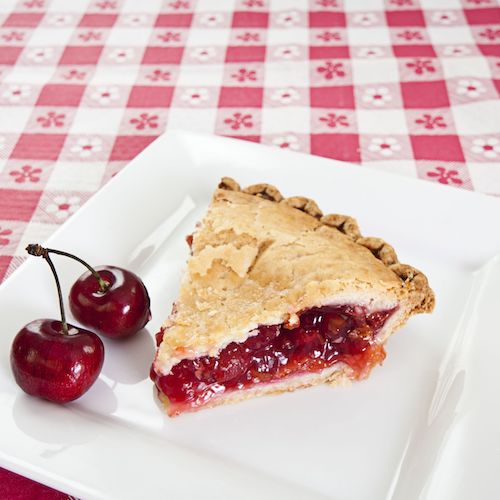
Example 2: the detail of the image is important
Serving suggestion
In this case, we can see that the detail of the image is central to conveying meaning. In this case, we would want to provide more detail in the alt text, e.g. “A slice of cherry pie served on a white plate with two fresh cherries beside it”
As you can see, there is no hard and fast rule other than to consider what content is missing when the image is missing!
Some special kinds of imagery
In some cases the visual imagery on the page is not actually an image. Common examples of this are font icons and emojis.
Font Icons
The examples in this article will focus particularly on Font Awesome icons, as it is one of the most popular and widely used font icon providers. Given they are so widely used, it’s no surprise that they have their own handy guide to how to use their icons accessibly; summarised below.
1. As before, ask: does this need alternative text?
If your icon is purely decorative, then alt text isn’t required. However, unlike with an image, a font icon does not have an “alt” attribute that you can set to empty. In this case, we can hide it from assistive technology users by using the ‘aria-hidden’ property. For example:
Please note that aria-hidden must be explicitly set to true as in the example, and the shorthand aria-hidden will not be effective.
2. Does the icon have an action?
If the icon is associated with an interactive element, such as a link, then we can add an ‘aria-label’ to the interactive element, while hiding the icon itself as in Step 1. For example:
3. In other cases, display some alternative text off-screen
As we cannot add alternative text to the icon itself, what we can do is add some actual text, but display it in a way to make it only visible to assistive technology users. This can be done using CSS and displaying the text off screen. As before, we will add ‘aria-hidden’ to the icon itself (NB: the ‘title’ attribute in Font Awesome allows a tooltip to appear for sighted users):
Emojis
Emojis are another special case in terms of imagery that doesn’t present itself in an ‘img’ tag. We can copy and paste the Unicode value of an emoji and have it show in your browser, but some extra steps are needed to make this accessible.
Hide if purely decorative
Similar to the font icon example above, we can hide the emoji if it is purely decorative. As the emoji does not have its own tag, however, we will need to wrap it in a ’span’ to do this:
Add an “img” role otherwise
In all other cases, we can ensure that the emoji is treated by the browser as an image. We can do this with the ‘role’ and ‘aria-label’ attributes. For example:
The code example above would produce: 📖
Final thoughts
All of the preceding guidance boils down to those few key considerations:
- Is this image purely decorative?
- Does this image have a function, or is it purely content?
- What content would the user miss out on if the image was missing?
The final question is the most difficult one to answer, but by taking a little time over this, you can improve the experience for all of your users, as well as your SEO!